Typography

00

An introduction to the module
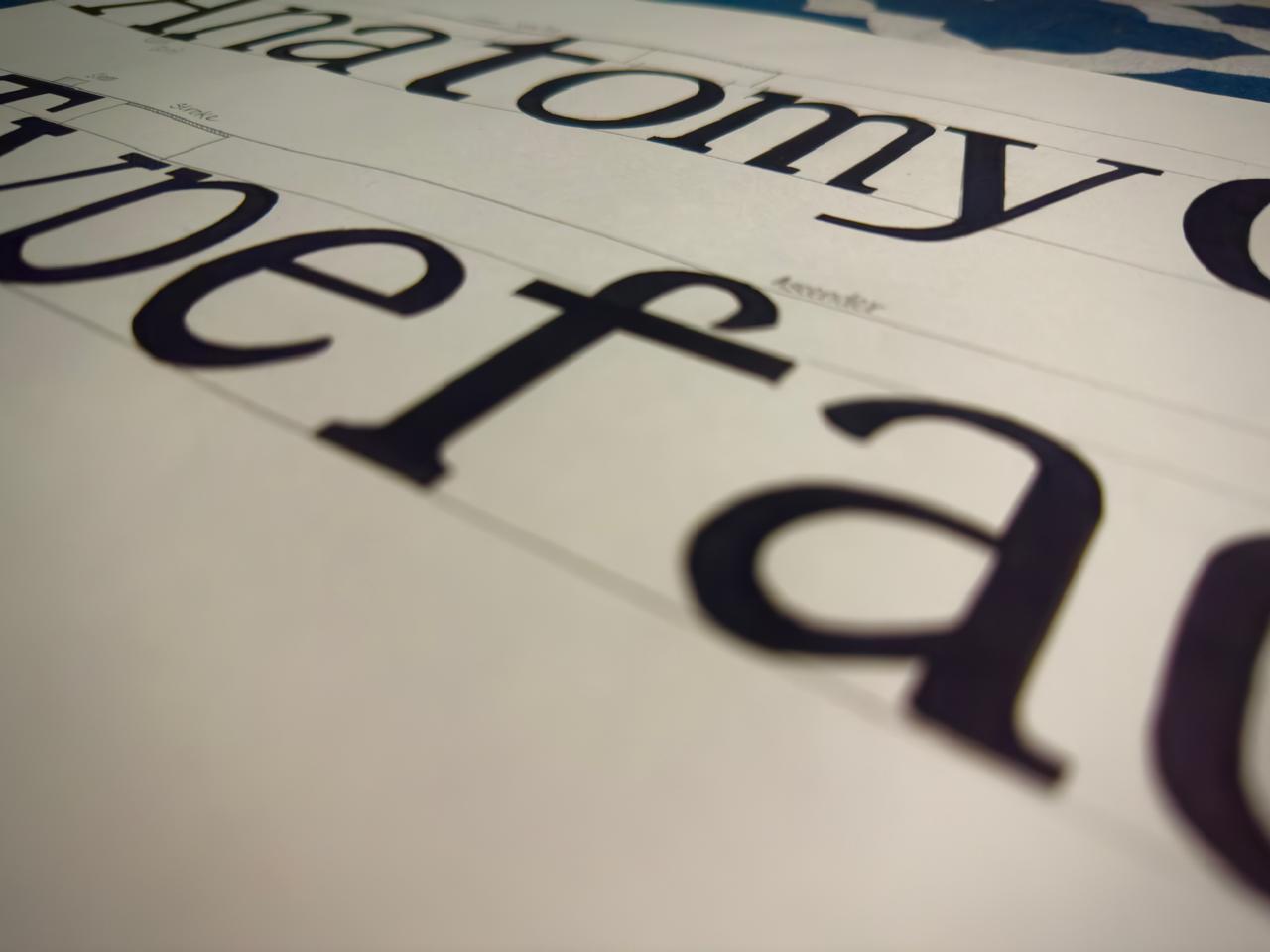
The Typography module was a comprehensive exploration of letterform construction, composition principles, and typographic expression across both manual and digital mediums. The course began with an in-depth anatomical study of a popular serif typeface, where we analyzed and documented the structural terminology and characteristics of each letterform to build a strong foundational understanding of typographic systems.
Module length: 22 days
The module then progressed into hands-on letter construction exercises using various tools and techniques. We practiced Rustica-style lettering with a flat brush, developed sans-serif skeleton structures using linear pens, and created serif alphabets with nib pens. These exercises emphasized stroke discipline, angle consistency, tracking control, and technical precision in manual type construction.
Moving into digital type design, we explored FontLab software to design a complete sans-serif alphabet (A–Z) along with numerics (0–9). This phase introduced us to digital font construction, spacing systems, proportional balance, and the technical workflow behind developing a cohesive typeface family.
The second half of the module focused on typographic composition. Through a series of structured assignments, we explored form-dominant and space-dominant layouts using single alphabets, words, sentences, and full paragraphs. Beginning with manual ink compositions and later transitioning to digital layouts in Adobe Illustrator, we studied hierarchy, rhythm, negative space, alignment, and spatial balance.
Experimental typography formed a significant part of the module. We designed letterforms based on geometric grids, explored analog and digital processes, and documented our conceptual and technical development. Another major assignment involved visually interpreting a movie title or dialogue through expressive typographic composition, prioritizing emotional tone, rhythm, distortion, scale variation, and conceptual depth over strict readability.
The module concluded with a research-based study of a renowned typographic designer. This included a written analysis of their philosophy, influential works, and contribution to design evolution, followed by the creation of a curated booklet that reflected their visual language while incorporating our own interpretation.
Overall, the Typography module strengthened both technical craftsmanship and conceptual thinking, building sensitivity toward letter anatomy, spatial relationships, typographic hierarchy, and expressive visual communication.